John Appleyard, New Section 3.1 28th May 2020
1. Introduction
 In this note, I will show that a straightforward mathematical model linking testing with confirmed cases and deaths is confirmed by analysis of published data. The resulting equation can be used to estimate real infection rates at any point in time, and can even be used to estimate the IFR. For the UK, on 2nd May, the estimated total infection rate was 4.1%, and the IFR was 1%. The model does not predict the future. Instead, it allows us to work out what published data can tell us about the true situation on any given date. The implications of unreported Covid-19 deaths are also discussed.
Since the middle of May, it’s become apparent that more and more countries are diverging from the simple model described here. The reasons for this divergence, and its significance are discussed in the new section 3.1.
1.1 Why is that Important?
Knowing what is happening is vital to rational decision making. Currently there appears to be a general understanding of the effect of testing on case numbers. This model provides a quantitative framework for that understanding. In cases where the true infection rate is determined accurately by random sampling, it should be possible to use the results to refine this model, allowing more precise estimates of infection rates where sampling evidence is not available.
2. The Model for Covid-19 Testing
A detailed mathematical description of the model is available here. This section contains a simplified version which describes the model behaviours when the number of confirmed cases is small, and when it is large, but not in the intermediate region.
If testing were random, the number of cases, C, found by T tests in a population P will be approximately:
C = I.(T/P)
where I is the total number infected. We don’t know I, but it’s related to the number of deaths by the infection fatality rate, f=D/I, so
C = (D.T)/(f.P)
This is model 1. Ideally, D should be time shifted to account for the delay between infection and death. This will be discussed further in section 6.
In the early stages of the pandemic, testing is not random, but is designed to find as many cases as possible. It focuses on a small part of the population comprising the contacts of existing cases, medical staff, and those with symptoms. If the size of that reduced population is proportional to C, then the number of cases found will be
C = (D.T)/(f.n.C)
C = sqrt((D.T)/(f.n))
where n is the constant of proportionality. This is model 2.
In effect, testing is concentrated on a bubble of contacts surrounding each case, and for small C (model 2), these bubbles are isolated. As C increases, the bubbles increasingly overlap, and eventually model 1 prevails.
3. Comparison with Published Data
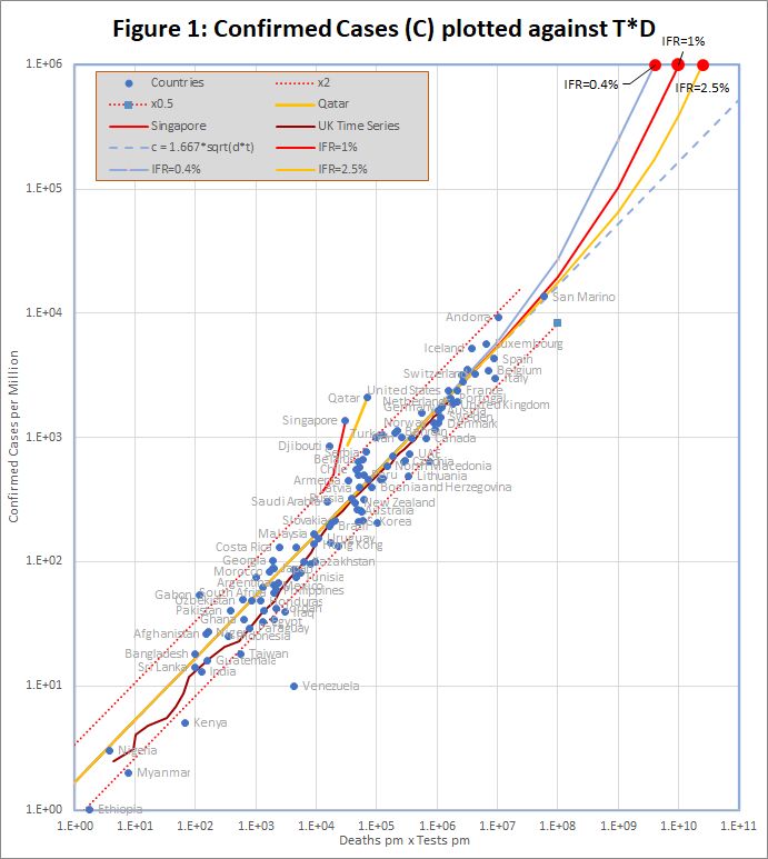
The data, downloaded from worldometers.info at the end of the 2nd May 2020, comprises 3 variables for each of 99 countries with more than 100 cases, and at least ten deaths. China is excluded because testing data is not available. The variables are the number of confirmed cases (C), deaths (D), and tests (T) per million of population. Some historic data, from the UK, Qatar and Singapore is also plotted as coloured traces.
Figure 1 shows that the data fits very well to the equation
C = 1.667 *sqrt(D*T)
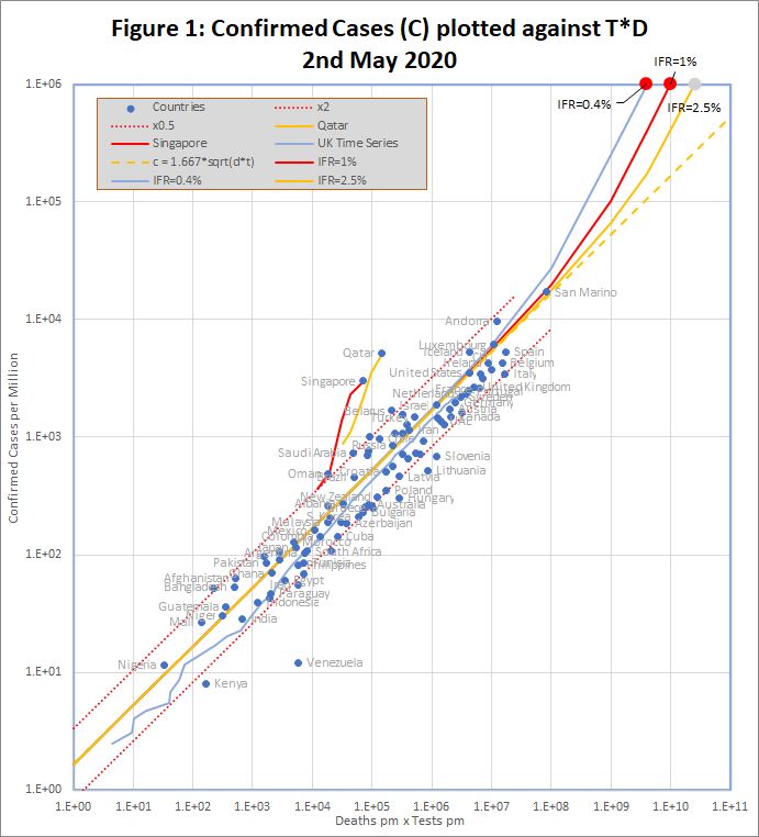
The match spans more than 3 orders of magnitude, but even so, almost all countries are within the tramlines, which indicate a factor of 2 either side of the predicted value. All data is measured per million of population, but the fit is equally good if raw numbers are used.
An even better fit can be obtained by using time shifted death data. This note will be updated with details in the next few days.
The red dots at the top of the chart represent the hypothetical situation in which the number cases approaches saturation (C = 1 million), and the eventual infection fatality rate (f) is 0.4%, 1% or 2.5%. The curves projecting down from those points show the trajectories predicted by the detailed model which end at each point.
There are many reasons to expect data from different countries to differ, including:
- Different health systems – some primitive, and others advanced
- Overloading makes even advanced health systems less effective
- Different demographics – Covid-19 is worse for older populations
- Time lags – e.g. confirmed cases may not survive, and reports may be delayed
- Different criteria for counting deaths and tests
- Political massaging of published data
The conclusion is that all of these factors combine to a factor of up to about 2.
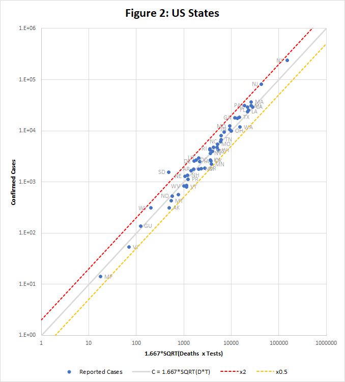
Figure 2 shows how the equation fits data for US states downloaded from https://covidtracking.com/data/us-daily on 3rd May. This time the raw data is used, without scaling to population. Only one state, South Dakota, falls outside the tramlines.
3.1. Examples of Divergence from Model
Figure 2a (plotted using data downloaded from https://ourworldindata.org/coronavirus) shows confirmed cases per million plotted against the product of deaths and tests per million on April 12th (black dots) and up to 26th May (yellow traces). It is apparent that although most countries fit the model well on April 12th, many have since broken away on both sides of the line.
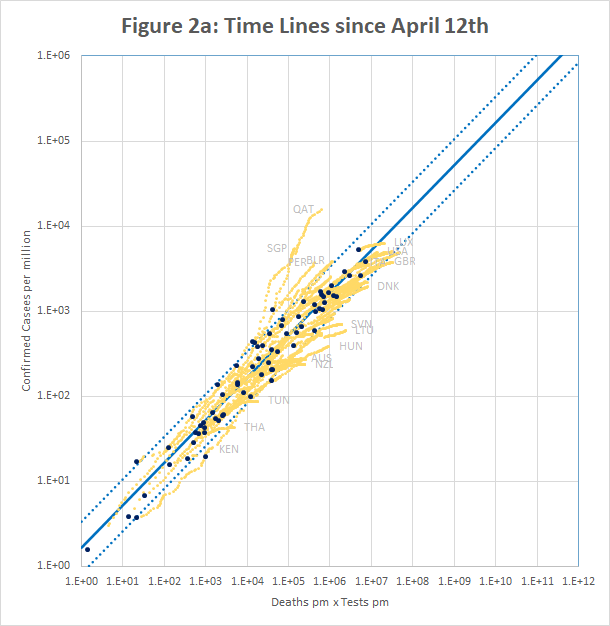
Qatar and Singapore and Singapore exemplify one type of break-out. In Singapore, the number of cases increased by a factor of 3.8 in a period when the number of tests increased by only 1.3. For Qatar it was 2.4 and 1.4. In both cases, the increase seems to be caused by the discovery of infection hot-spots among expatriate workers. For example the Singapore MOH issued a press release on 20th April saying “As of 20 April 2020, 12pm, the Ministry of Health (MOH) has preliminarily confirmed an additional 1,426 cases of COVID-19 infection in Singapore, the vast majority of whom are Work Permit holders residing in foreign worker dormitories. 16 cases are Singaporeans/ Permanent Residents.” This point is discussed further in Section 5.
On the other side of the line, many countries have managed to control the rate of new infections, but are still testing large numbers of people and finding very few new cases. For example, in the week to 15th May, Australia is reported to have conducted over 200,000 tests, but found fewer than 100 new cases. This highlights a weakness of the model described in section 2 – the implicit assumption that testing is a scarce resource. In Australia, the ratio of tests to cases never fell below about 15, whereas in some European countries, figures of 2 or less were seen.
4. Predicting the Real Infection Rate
The model predicts that when C is small, it varies with the square root of the number of people who have been tested. That means that we can predict I, the number of cases that would be found if we tested the entire population (P) using
I = C*sqrt(P/T)
A problem is that countries report tests differently. Most report the number of samples tested, regardless of their origin, but others report the number of people tested, discounting repeat tests on the same individual. The latter is more useful for extrapolation. If we assume that the number of tests for each individual is r, then the above equation would be:
I = C*sqrt(r.P/T)
and I would be increased by a factor of sqrt(r). This factor is partially responsible for the deviation from the model of individual countries and states in Figures 1 and 2.
This simple formula breaks down as C increases, because it depends on the assumption that there is no overlap between the contacts of individual cases. A more thorough, but somewhat mathematical theory, which allows for that overlap, is described in this note.
The more detailed theory requires an estimate of the infection fatality rate (IFR) – the percentage of all infected patients who will eventually die. That number may vary between countries, but is probably about 1% in Europe and North America.
Table 1 shows the top 50 countries as of 2nd May. There are estimates of the percentage of the population that is infected, using basic extrapolation to 100% testing, and the detailed model with different assumptions about the IFR. The multiplier is sqrt(P/T), and is an indication of the likely error in the figures: a high value means that the model is extrapolating further and may be more error prone. For countries which report samples tested rather people tested, r, the number of tests per person is assumed to be 1.4, which increases the calculated infection rate by about 20%.
Table 1 Reported Cases and “Real” Infections per Million – 2nd May
| 2nd May 2020 | Reported Cases | Multiplier | Basic Model | Infections IFR=2.5% | Infections IFR=1% | Infections IFR=0.4% |
| San Marino | 1.71% | 4.45 | 7.61% | 9.24% | 14.15% | 27.59% |
| Andorra | 0.97% | 8.04 | 7.77% | 8.95% | 11.84% | 24.67% |
| Belgium | 0.43% | 7.88 | 3.37% | 3.93% | 5.37% | 11.44% |
| Spain | 0.53% | 6.54 | 3.44% | 3.92% | 5.10% | 10.32% |
| UK | 0.27% | 10.73 | 2.88% | 3.25% | 4.10% | 8.16% |
| USA | 0.35% | 8.18 | 2.87% | 3.11% | 3.58% | 5.79% |
| Ireland | 0.43% | 6.39 | 2.74% | 2.99% | 3.52% | 6.01% |
| France | 0.26% | 9.11 | 2.35% | 2.63% | 3.27% | 6.31% |
| Ecuador | 0.52% | 5.51 | 2.85% | 3.00% | 3.27% | 4.26% |
| Italy | 0.35% | 6.34 | 2.19% | 2.48% | 3.15% | 6.23% |
| Isle of Man | 0.23% | 9.71 | 2.28% | 2.49% | 2.92% | 4.96% |
| Switzerland | 0.16% | 14.67 | 2.28% | 2.47% | 2.84% | 4.53% |
| Qatar | 0.61% | 4.51 | 2.75% | 2.77% | 2.82% | 2.93% |
| Netherlands | 0.22% | 9.35 | 2.05% | 2.26% | 2.70% | 4.85% |
| Channel Islands | 0.38% | 5.60 | 2.11% | 2.29% | 2.67% | 4.46% |
| Sweden | 0.34% | 5.83 | 2.01% | 2.21% | 2.62% | 4.58% |
| Luxembourg | 0.31% | 7.08 | 2.21% | 2.34% | 2.58% | 3.63% |
| Moldova | 0.10% | 21.91 | 2.20% | 2.27% | 2.39% | 2.78% |
| Panama | 0.16% | 13.76 | 2.14% | 2.23% | 2.37% | 2.84% |
| Singapore | 0.30% | 7.54 | 2.26% | 2.28% | 2.31% | 2.40% |
| Iran | 0.11% | 15.58 | 1.79% | 1.88% | 2.04% | 2.63% |
| Iceland | 0.53% | 3.09 | 1.63% | 1.67% | 1.73% | 1.92% |
| Dominican Republic | 0.07% | 22.46 | 1.57% | 1.62% | 1.71% | 1.97% |
| Turkey | 0.25% | 6.15 | 1.52% | 1.57% | 1.67% | 1.96% |
| Portugal | 0.15% | 9.69 | 1.43% | 1.51% | 1.64% | 2.19% |
| Peru | 0.13% | 11.39 | 1.47% | 1.52% | 1.61% | 1.88% |
| Germany | 0.20% | 6.79 | 1.34% | 1.40% | 1.52% | 1.96% |
| Brazil | 0.05% | 29.61 | 1.34% | 1.39% | 1.47% | 1.71% |
| Belarus | 0.17% | 8.23 | 1.38% | 1.40% | 1.44% | 1.55% |
| Austria | 0.15% | 7.86 | 1.18% | 1.23% | 1.33% | 1.65% |
| Chile | 0.17% | 6.47 | 1.12% | 1.14% | 1.18% | 1.28% |
| Canada | 0.11% | 9.44 | 1.01% | 1.07% | 1.16% | 1.54% |
| Israel | 0.10% | 10.81 | 1.04% | 1.07% | 1.11% | 1.26% |
| Denmark | 0.16% | 6.05 | 0.98% | 1.03% | 1.11% | 1.43% |
| Serbia | 0.19% | 5.45 | 1.02% | 1.05% | 1.09% | 1.22% |
| Armenia | 0.08% | 13.39 | 1.03% | 1.05% | 1.08% | 1.17% |
| North Macedonia | 0.14% | 6.57 | 0.95% | 0.98% | 1.04% | 1.23% |
| Algeria | 0.07% | 13.16 | 0.95% | 0.97% | 1.00% | 1.08% |
| Saudi Arabia | 0.01% | 89.56 | 0.88% | 0.89% | 0.90% | 0.95% |
| Finland | 0.07% | 11.15 | 0.82% | 0.84% | 0.89% | 1.05% |
| Norway | 0.09% | 8.64 | 0.81% | 0.83% | 0.88% | 1.02% |
| Romania | 0.07% | 11.89 | 0.79% | 0.82% | 0.86% | 1.02% |
| Estonia | 0.13% | 5.84 | 0.75% | 0.77% | 0.81% | 0.95% |
| Mexico | 0.02% | 44.50 | 0.72% | 0.73% | 0.76% | 0.84% |
| Bosnia and Herzegovina | 0.06% | 11.84 | 0.66% | 0.68% | 0.71% | 0.80% |
| Croatia | 0.05% | 12.37 | 0.63% | 0.64% | 0.67% | 0.75% |
| Oman | 0.05% | 13.29 | 0.65% | 0.65% | 0.66% | 0.68% |
| Kuwait | 0.11% | 5.78 | 0.63% | 0.63% | 0.65% | 0.69% |
| Russia | 0.09% | 7.20 | 0.61% | 0.62% | 0.64% | 0.68% |
| Albania | 0.03% | 21.56 | 0.59% | 0.60% | 0.62% | 0.67% |
5. What about Deaths that are not reported?
It is known that Covid-19 deaths are under-reported in many countries. For example, the UK has, until recently, reported only deaths in hospital, and not, for example, those in care homes, even if they have previously tested positive for Covid-19.In other countries there are reports of mass graves for people who have died, presumably from Covid-19, without appearing as a case or a death in official figures.
It’s difficult to reconcile this with the apparent precision of the predictions of the model. But the fit is just too good to have arisen by chance – it must be telling us something.
I suggest that the answer is that, in many countries, there are two populations. One that is “in” the system, and will be tested and end up in hospital if they get ill. The figures we have relate to solely to that population. The other “out” population is not tested, and if they die, do not die in hospital.If that is the case, then the value of P we use in the equations should not be the total population of the country, but the number who are “in” the system of testing and hospitalization.
That makes no difference for C<<f.P: the equation for model 2 in section 2 does not depend on P. This is why the model works for countries with very large “out” populations. For C>>f.P on the other hand, the prediction veers away from model 2 towards model 1, which does depend on P. As a result, countries with large “out” populations will diverge from the straight line of model 2 sooner than expected.
This idea may also shed some light on why Qatar and Singapore appear to be diverging from the model. Some of the “out” population (expatriate workers) are joining the “in” system.
6. National and Regional Time Series with Time-Shifted Death Data
A key unknown in Covid-19 statistics is the infection fatality rate (IFR), defined as the percentage of all those infected who will eventually die as a result. This is not the same as the case fatality rate (CFR), which is simply the current number of deaths divided by the number of confirmed cases. The two figures can be dramatically different, and the latter should not be used naively to compare countries, or to assess how a country’s health system is performing. Some key problems with the CFR are:
- The true number of infections, I, may differ from the number of confirmed cases, C by a factor of 10 or more, depending on how much testing has been done.
- Reported deaths, cases and tests all have different time lags. A death may be reported in statistics some time after it actually happened, and may result from an infection that was confirmed many days before, using a test that was performed before that. The original infection would have happened several days before that. The various delays will be handled differently in different places. The key delay is between the the report of a confirmed infection, and, if the patient dies, the report of the death.
In this section, those two problems are addressed as follows:
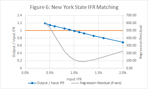
- A method for estimating I was described in section 4. However the method requires an estimate of the IFR, so the IFR is both the output from and an input to the procedure. This problem is addressed by adjusting the value until input and output match.
- By using time series data, we can adjust for the interval between the reports of infection and subsequent death. The objective is to match the shapes of the Infection v Time and Deaths v Time curves. If this is successful, the ratio D/I will be constant in time, whether new infections are rising exponentially, in the initial stages of the pandemic, or falling back after measures to control transmission are enacted.
Figures 3 to 5 show the results obtained using data from New York State, using an IFR of 1% and a time shift of 10 days on reported deaths. The model works well from late March, when numbers were low but rising exponentially, and across the peak until early May.
For the state as a whole, the model predicts that 10.6% of the population were infected on 30th April. This is rather less than the 13.9% found in a serological survey reported here, but the gap is not unbridgeable, given the limitations of the survey and possible tweaking of the model.
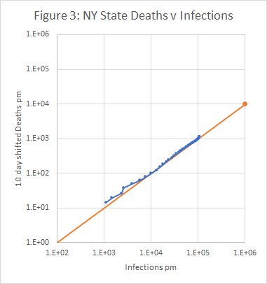
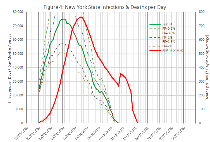
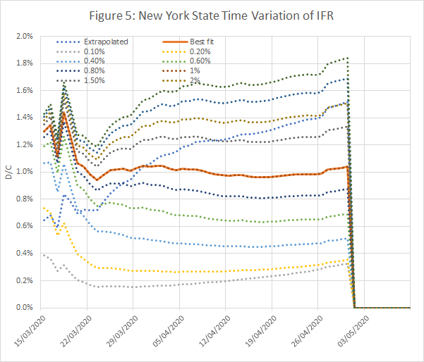
Figure 6 shows that the input and output IFRs match at a value of 1%. It also shows a measure of the regression error in Figure 3.
For the UK, the optimum time shift is unusually low, at 3 days, and the IFR is 1% (see Figure 7). Some additional evidence against lower IFRs in the UK is that they cause the model to overshoot (predict negative new infections per day) at the beginning of May.

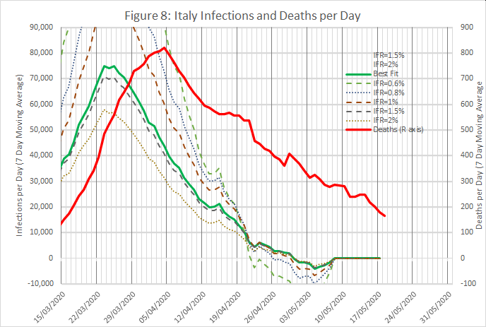
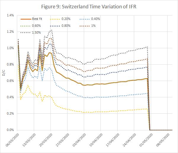
Figures 8 and 9 show results from an analysis of data from Italy and Switzerland, wth IFRs of 1.4% and 0.6% respectively. The time shifts were 10 and 12 days.
The procedure has been tried on 24 countries, including most of those with the highest infection and death rates, and a single page summary produced for each one. The summary contains:
- A plot of deaths v infections. If the model is working, this should be a straight line with a gradient equal to the IFR.
- A time series plot of the ratio of deaths to infections for different assumed IFRs. This should be constant over a long period, preferably including both the initial exponential growth phase, and the subsequent peak and decline. The model is consistent if the ratio equals the assumed IFR.
- A plot showing the how the predicted IFR varies with the assumed IFR. The model is consistent when the two match. The same plot also includes a goodness of fit measure (weighted R squared) for the deaths v infections plot. Ideally the Rsquared value should be close to 1, and should be close to a maximum at the point where input and output IFRs match.
- A plot showing the time variation of infections per day and deaths per day, both averaged over 7 days. Ideally the two curves should be the same shape, but separated by an interval which is the time shift to be used in the model.
- A plot showing the correlation between the infections per day and deaths per day curves for different time shifts and IFRs. Ideally there should be a clear maximum with a correlation close to 1.
The countries are listed in Table 2, with a link to the summary page for each one.
Table 2 Application of Model to 24 Countries
| IFR | Rsq | Time Shift | Subjective | |
| Netherlands | 1.00% | 0.996 | 7 | Good |
| Russia | 0.40% | 0.996 | 6 | Good |
| US | 0.70% | 0.995 | 11 | Good |
| France | 1.40% | 0.989 | 11 | Good |
| Ireland | 0.85% | 0.989 | 10 | Good |
| NY State | 1.00% | 0.988 | 9 | Good |
| Canada | 1.00% | 0.985 | 15 | Good |
| Mexico | 1.10% | 0.983 | 17 | Good |
| UK | 1.20% | 0.978 | 5 | Good |
| Germany | 0.55% | 0.978 | 14 | Good |
| Ecuador | 0.17% | 0.978 | 6 | Good |
| Peru | 0.33% | 0.975 | 11 | Medium |
| Belgium | 1.60% | 0.971 | 10 | Good |
| Italy | 1.70% | 0.959 | 12 | Medium |
| Switzerland | 0.70% | 0.955 | 13 | Good |
| Sweden | 1.00% | 0.928 | 6 | Good |
| Turkey | 0.25% | 0.927 | 10 | Medium |
| Norway | 0.35% | 0.911 | 14 | Medium |
| Portugal | 0.70% | 0.877 | 15 | Bad |
| Austria | 0.40% | 0.721 | 15 | Bad |
| Australia | 0.12% | 0.625 | 11 | Bad |
| Iran | 0.35% | 0.322 | 0 | Awful |
| Denmark | 0.70% | 0.243 | 7 | Awful |
| Luxemburg | 0.50% | -6.6 | 4 | Awful |
The model works well in most countries, but with some exceptions, especially in countries such as Australia which have been notably successful in containing the spread of the infection. It’s also noticeable that some countries appear to fit the model well, and have an extremely low IFR. This could be because, as discussed in Section 5, there is a large “out” population, who are excluded from the system of testing and hospitalization. Reducing the “in” population has the effect of increasing the predicted IFR.
The above figures are intended purely as illustrations, and may be subject to systematic error; in every case, it’s likely that improved data and adaptation to local nuances could improve the model. For example, the estimate of the real current infection rate depends on the number of tests conducted, and different countries measure this in different ways – either as the total number of tests conducted, or the number of people tested (even if tested several times).
Disclaimer: I trained as a physicist to PhD level many years ago, and my career required good numeracy. However, I have no special expertise in epidemiology or statistics.